React Native Tabeller

This is a table component for react native.
Demos
Installation
npm install https://git.sheetjs.com/asadbek064/react-native-tabeller/raw/branch/main/react-native-tabeller-0.1.0.tgz
import { Table, TableWrapper, Row, Rows, Col, Cols, Cell } from 'react-native-tabeller';
Examples
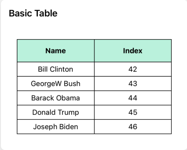
Basic Table
import { Table, Row, Rows } from 'react-native-tabeller';
import { View, StyleSheet } from 'react-native';

export const BasicExample = () => {
  const tableHead: string[] = ['Name', 'Index'];
  const tableData: string[][] = [
    ['Bill Clinton', '42'],
    ['GeorgeW Bush', '43'],
    ['Barack Obama', '44'],
    ['Donald Trump', '45'],
    ['Joseph Biden', '46']
  ];
  return (
    <View style={styles.container}>
      <Table borderStyle={{ borderWidth: 1 }}>
        <Row
          data={tableHead}
          style={styles.head}
          textStyle={styles.headText}
        />
        <Rows
          data={tableData}
          textStyle={styles.text}
        />
      </Table>
    </View>
  );
}

const styles = StyleSheet.create({
  container: {
    flex: 1,
    padding: 16,
    paddingTop: 30,
    backgroundColor: '#fff'
  },
  head: {
    height: 44,
    backgroundColor: '#C6F3E0'
  },
  text: {
    textAlign: 'center',
    padding: 5
  },
  headText: {
    textAlign: 'center',
    fontWeight: 'bold'
  }
});
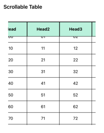
Scrollable Example
import { Table, Row, Rows } from 'react-native-tabeller';
import { View, StyleSheet, ScrollView } from 'react-native';

export const ScrollableExample = () => {
  const tableHead = ['Head', 'Head2', 'Head3', 'Head4', 'Head5', 'Head6', 'Head7', 'Head8'];
  const widthArr = [40, 69, 80, 100, 120, 140, 160, 180];

  // generate a large table data
  const tableData = [];
  for (let i = 0; i < 30; i += 1) {
    const rowData = [];
    for (let j = 0; j < 8; j += 1) {
      rowData.push(`${i}${j}`);
    }
    tableData.push(rowData);
  }

  return (
    <View style={styles.container}>
      <ScrollView horizontal={true}>
        <View>
          <Table borderStyle={{ borderWidth: 2, borderColor: '#00000' }}>
            <Row
              data={tableHead}
              widthArr={widthArr}
              style={styles.header}
              textStyle={styles.headerText}
            />
          </Table>
          <ScrollView style={styles.dataWrapper}>
            <Table borderStyle={{ borderWidth: 1, borderColor: '#00000' }}>
              <Rows
                data={tableData}
                widthArr={widthArr}
                style={styles.row}
                textStyle={styles.text}
              />
            </Table>
          </ScrollView>
        </View>
      </ScrollView>
    </View>
  );
};

const styles = StyleSheet.create({
  container: {
    flex: 1,
    padding: 16,
    paddingTop: 30,
    height: 400,
    backgroundColor: '#fff',
  },
  header: {
    height: 50,
    backgroundColor: '#C6F3E0'
  },
  headerText: {
    textAlign: 'center',
    fontWeight: 'bold'
  },
  text: {
    textAlign: 'center',
    padding: 5
  },
  dataWrapper: {
    marginTop: -1
  },
  row: {
    height: 40,
    backgroundColor: '#fff'
  }
});
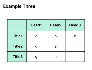
Example three
import { Table, TableWrapper, Row, Rows, Col } from 'react-native-tabeller';
import { View, StyleSheet } from 'react-native';

export const ExampleThree = () => {
  const tableHead = ['', 'Head1', 'Head2', 'Head3'];
  const tableTitle = ['Title1', 'Title2', 'Title3'];
  const tableData = [
    ['a', 'b', 'c'],
    ['d', 'e', 'f'],
    ['g', 'h', 'i']
  ];

  const onCellPress = (data: any) => {
    console.log(`Cell pressed: ${data}`);
  };

  return (
    <View style={styles.container}>
      <Table borderStyle={{ borderWidth: 1 }}>
        <Row
          data={tableHead}
          style={styles.head}
          textStyle={styles.headText}
        />
        <TableWrapper style={styles.wrapper}>
          <Col
            data={tableTitle}
            style={styles.title}
            heightArr={[28, 28, 28]}
            textStyle={styles.titleText}
          />
          <Rows
            data={tableData}
            flexArr={[1, 1, 1]}
            style={styles.row}
            textStyle={styles.text}
            onPress={onCellPress}
          />
        </TableWrapper>
      </Table>
    </View>
  );
};

const styles = StyleSheet.create({
  container: {
    flex: 1,
    padding: 16,
    paddingTop: 30,
    backgroundColor: '#fff'
  },
  head: {
    height: 44,
    backgroundColor: '#C6F3E0'
  },
  text: {
    textAlign: 'center',
    padding: 5
  },
  headText: {
    textAlign: 'center',
    fontWeight: 'bold'
  },
  row: {
    height: 40,
    backgroundColor: '#fff'
  },
  wrapper: {
    flexDirection: 'row'
  },
  title: {
    flex: 1,
    backgroundColor: '#C6F3E0'
  },
  titleText: {
    textAlign: 'left',
    marginLeft: 6,
    fontWeight: '600'
  }
});
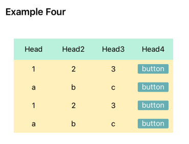
Example Four
import React, { useState } from 'react';
import { StyleSheet, View, Text, TouchableOpacity, Alert } from 'react-native';
import { Table, TableWrapper, Row, Cell } from 'react-native-tabeller';

type TableDataType = string[][];

export const ExampleFour: React.FC = () => {
  const [tableHead] = useState<string[]>(['Head', 'Head2', 'Head3', 'Head4']);
  const [tableData] = useState<TableDataType>([
    ['1', '2', '3', '4'],
    ['a', 'b', 'c', 'd'],
    ['1', '2', '3', '4'],
    ['a', 'b', 'c', 'd']
  ]);

  const alertIndex = (index: number): void => {
    Alert.alert(`This is row ${index + 1}`);
  };

  const element = (data: any, index: number): React.ReactElement => (
    <TouchableOpacity onPress={() => alertIndex(index)}>
      <View style={styles.btn}>
        <Text style={styles.btnText}>button</Text>
      </View>
    </TouchableOpacity>
  );

  return (
    <View style={styles.container}>
      <Table borderStyle={{ borderColor: 'transparent' }}>
        <Row data={tableHead} style={styles.head} textStyle={styles.text} />
        {
          tableData.map((rowData, index) => (
            <TableWrapper key={index} style={styles.row}>
              {
                rowData.map((cellData, cellIndex) => (
                  <Cell
                    key={cellIndex}
                    data={cellIndex === 3 ? element(cellData, index) : cellData}
                    textStyle={styles.text}
                  />
                ))
              }
            </TableWrapper>
          ))
        }
      </Table>
    </View>
  );
};

const styles = StyleSheet.create({
  container: { flex: 1, padding: 16, paddingTop: 30, backgroundColor: '#fff' },
  head: { height: 40, backgroundColor: '#C6F3E0' },
  text: { margin: 8 },
  row: { flexDirection: 'row', backgroundColor: '#FFF1C1' },
  btn: { width: 58, height: 18, backgroundColor: '#78B7BB', borderRadius: 2 },
  btnText: { textAlign: 'center', color: '#fff' }
});

export default ExampleFour;
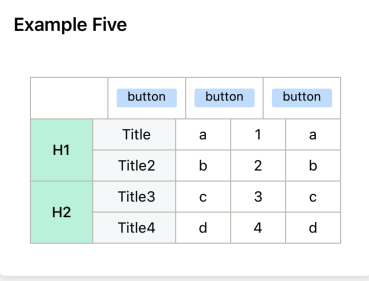
Example Five
import React, { useState } from 'react';
import { StyleSheet, View, Text, TouchableOpacity, Alert } from 'react-native';
import { Table, TableWrapper, Row, Col, Rows } from 'react-native-tabeller';

export const ExampleFive: React.FC = () => {
    const alertIndex = (value: string): void => {
        Alert.alert(`This is column ${value}`);
    };

    const elementButton = (value: string): React.ReactElement => (
        <TouchableOpacity onPress={() => alertIndex(value)}>
            <View style={styles.btn}>
                <Text style={styles.btnText}>button</Text>
            </View>
        </TouchableOpacity>
    );

    const [tableHead] = useState<any[]>(['', elementButton('1'), elementButton('2'), elementButton('3')]);
    const [sideHead] = useState<string[]>(['H1', 'H2']);
    const [rowTitles] = useState<string[]>(['Title', 'Title2', 'Title3', 'Title4']);

    // Table data - matching the structure in the screenshot
    const [tableData] = useState<string[][]>([
        ['a', '1', 'a'],
        ['b', '2', 'b'],
        ['c', '3', 'c'],
        ['d', '4', 'd']
    ]);

    return (
        <View style={styles.container}>
            <Table borderStyle={{ borderWidth: 1, borderColor: '#C1C0B9' }}>
                {/* table header row with buttons */}
                <Row
                    data={tableHead}
                    style={styles.header}
                    textStyle={styles.headerText}
                    flexArr={[1, 1, 1, 1]}
                />

                <TableWrapper style={styles.wrapper}>
                    {/* left column with H1, H2 */}
                    <Col
                        data={sideHead}
                        style={styles.sideHeader}
                        heightArr={[60, 60]}
                        textStyle={styles.sideHeaderText}
                    />

                    <TableWrapper style={styles.tableContentWrapper}>
                        {/* row titles column */}
                        <Col
                            data={rowTitles}
                            style={styles.title}
                            heightArr={[30, 30, 30, 30]}
                            textStyle={styles.titleText}
                        />

                        {/* content cells */}
                        <Rows
                            data={tableData}
                            style={styles.row}
                            flexArr={[1, 1, 1]}
                            textStyle={styles.text}
                        />
                    </TableWrapper>
                </TableWrapper>
            </Table>
        </View>
    );
};

const styles = StyleSheet.create({
    container: {
        flex: 1,
        padding: 16,
        paddingTop: 30,
        backgroundColor: '#fff'
    },
    header: {
        height: 40,
        backgroundColor: '#fff'
    },
    headerText: {
        textAlign: 'center',
        fontWeight: '500'
    },
    wrapper: {
        flexDirection: 'row'
    },
    sideHeader: {
        width: 60,
        backgroundColor: '#C6F3E0'
    },
    sideHeaderText: {
        textAlign: 'center',
        fontWeight: '500'
    },
    tableContentWrapper: {
        flex: 1,
        flexDirection: 'row'
    },
    title: {
        width: 80,
        backgroundColor: '#f6f8fa'
    },
    titleText: {
        textAlign: 'left',
        paddingLeft: 5
    },
    row: {
        height: 30
    },
    text: {
        textAlign: 'center'
    },
    btn: {
        width: 58,
        height: 18,
        backgroundColor: '#c8e1ff',
        borderRadius: 2,
        alignSelf: 'center'
    },
    btnText: {
        textAlign: 'center',
        fontSize: 12
    }
});

export default ExampleFive;
Properties
Table Component Properties
| Prop |
Type |
Description |
Default |
| style |
Style |
Container style for the table |
null |
| borderStyle |
Object |
Table border line width and color |
{ borderWidth: 0, borderColor: '#000' } |
| children |
ReactNode |
Table content |
Required |
TableWrapper Component Properties
| Prop |
Type |
Description |
Default |
| style |
Style |
Container style |
null |
| borderStyle |
Object |
Table border line width and color |
{ borderWidth: 0, borderColor: '#000' } |
| children |
ReactNode |
TableWrapper content |
Required |
Cell Component Properties
| Prop |
Type |
Description |
Default |
| data |
string | number | null |
Cell content |
null |
| width |
number |
Cell width in pixels |
null |
| height |
number |
Cell height in pixels |
null |
| flex |
number |
Flex value for the cell |
1 (if no width, height, or style) |
| style |
Style |
Container style |
null |
| textStyle |
Style |
Text style for cell content |
null |
| borderStyle |
Object |
Cell border line width and color |
{ borderWidth: 0, borderColor: '#000' } |
| cellContainerProps |
ViewProps |
Props passed to the cell container |
{} |
| onPress |
Function |
Callback when cell is pressed |
null |
| children |
ReactNode |
Children to render inside the cell |
null |
Row Component Properties
| Prop |
Type |
Description |
Default |
| data |
Array<string | number | null> |
Array of data items for each cell in the row |
Required |
| style |
Style |
Container style |
null |
| widthArr |
number[] |
Array of widths for each cell |
[] |
| height |
number |
Height for the entire row |
null |
| flexArr |
number[] |
Array of flex values for each cell in the row |
[] |
| textStyle |
Style |
Text style applied to all cells in the row |
null |
| borderStyle |
Object |
Border line width and color |
{ borderWidth: 0, borderColor: '#000' } |
| cellTextStyle |
Function |
Function to generate custom text styles for individual cells |
null |
| onPress |
Function |
Callback when a cell is pressed |
null |
Rows Component Properties
| Prop |
Type |
Description |
Default |
| data |
Array<Array<string | number | null>> |
2D array of data for rows and cells |
Required |
| style |
Style |
Container style |
null |
| widthArr |
number[] |
Array of widths for each column |
[] |
| heightArr |
number[] |
Array of heights for each row |
[] |
| flexArr |
number[] |
Array of flex values for each column |
[] |
| textStyle |
Style |
Text style applied to all cells |
null |
| borderStyle |
Object |
Border line width and color |
{ borderWidth: 0, borderColor: '#000' } |
| onPress |
Function |
Callback when a cell is pressed |
null |
Col Component Properties
| Prop |
Type |
Description |
Default |
| data |
Array<string | number | null> |
Array of data items for each cell in the column |
Required |
| style |
Style |
Container style |
null |
| width |
number |
Width for the entire column |
null |
| heightArr |
number[] |
Array of heights for each cell |
[] |
| flex |
number |
Flex value for the column |
null |
| textStyle |
Style |
Text style applied to all cells in the column |
null |
| borderStyle |
Object |
Border line width and color |
{ borderWidth: 0, borderColor: '#000' } |
Cols Component Properties
| Prop |
Type |
Description |
Default |
| data |
Array<Array<string | number | null>> |
2D array of data for columns and cells |
Required |
| style |
Style |
Container style |
null |
| widthArr |
number[] |
Array of widths for each column |
[] |
| heightArr |
number[] |
Array of heights for each cell in a column |
[] |
| flexArr |
number[] |
Array of flex values for each column |
[] |
| textStyle |
Style |
Text style applied to all cells |
null |
| borderStyle |
Object |
Border line width and color |
{ borderWidth: 0, borderColor: '#000' } |
StickyTable Component Properties
| Prop |
Type |
Description |
Default |
| data |
Array<Array<string | number | null>> |
Full table data including first column |
Required |
| stickyColumnWidth |
number |
Width of the sticky column |
Required |
| columnWidths |
number[] |
Widths for non-sticky columns |
[] |
| style |
Style |
Style for the container |
null |
| cellStyle |
Style |
Style for cells |
null |
| textStyle |
Style |
Text style for cell content |
null |
| headerStyle |
Style |
Style for header row |
null |
| headerTextStyle |
Style |
Text style for header cells |
null |
| borderStyle |
Object |
Border style |
{ borderWidth: 1, borderColor: '#000' } |
Notice
Col and Cols components do not support automatic height adjustment- Use the
textStyle property to set margins - avoid using padding
- If the parent element is Not
Table component, specify the borderStyle
<ScrollView horizontal={true}>
  {/* add borderStyle if the parent is not a Table component */}
  <TableWrapper borderStyle={{ borderWidth: 2, borderColor: 'green' }}>
    <Cols data={data} />
  </TableWrapper>
</ScrollView>
Contributing
See the contributing guide to learn how to contribute to the repository and the development workflow.
License
Apache License, Version 2.0 (ALv2)