React Native Tabeller

This is a table component for react native.
Demos
Installation
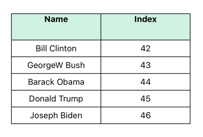
Basic Table
Scrollable Example
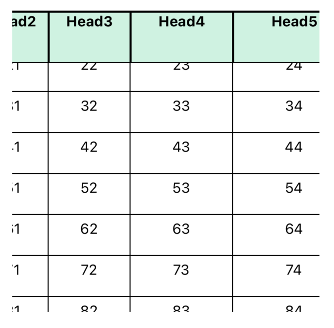
Sticky Column Example
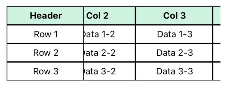
Example three
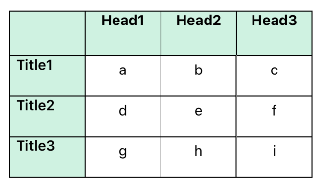
Example Four
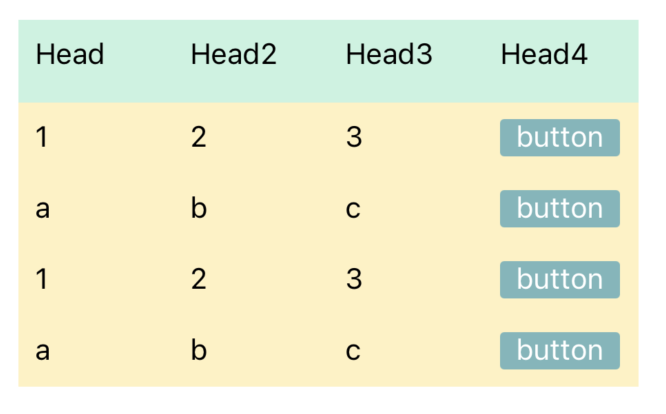
Example Five
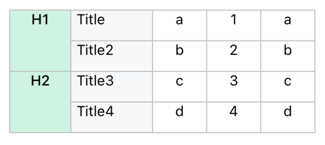
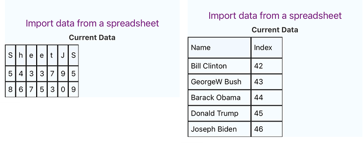
SheetJS Fetch Example
Properties
Table Component Properties
| Prop |
Type |
Description |
Default |
| style |
Style |
Container style for the table |
null |
| borderStyle |
Object |
Table border line width and color |
{ borderWidth: 0, borderColor: '#000' } |
| children |
ReactNode |
Table content |
Required |
TableWrapper Component Properties
| Prop |
Type |
Description |
Default |
| style |
Style |
Container style |
null |
| borderStyle |
Object |
Table border line width and color |
{ borderWidth: 0, borderColor: '#000' } |
| children |
ReactNode |
TableWrapper content |
Required |
Cell Component Properties
| Prop |
Type |
Description |
Default |
| data |
string | number | null |
Cell content |
null |
| width |
number |
Cell width in pixels |
null |
| height |
number |
Cell height in pixels |
null |
| flex |
number |
Flex value for the cell |
1 (if no width, height, or style) |
| style |
StyleProp |
Container style |
null |
| textStyle |
StyleProp |
Text style for cell content |
null |
| borderStyle |
BorderStyle |
Cell border line width and color |
{ borderWidth: 0, borderColor: '#000' } |
| cellContainer |
ViewProps |
Props passed to the cell container |
{} |
| onPress |
(data: any) => void |
Callback when cell is pressed |
null |
| children |
ReactNode |
Children to render inside the cell |
null |
Row Component Properties
| Prop |
Type |
Description |
Default |
| data |
Array<string | number | null> |
Array of data items for each cell in the row |
Required |
| style |
StyleProp |
Container style |
null |
| widthArr |
number[] |
Array of widths for each cell |
[] |
| height |
number |
Height for the entire row |
null |
| flexArr |
number[] |
Array of flex values for each cell in the row |
[] |
| textStyle |
StyleProp |
Text style applied to all cells in the row |
null |
| borderStyle |
BorderStyle |
Border line width and color |
{ borderWidth: 0, borderColor: '#000' } |
| cellTextStyle |
(item: any) => StyleProp |
Function to generate custom text styles for individual cells |
null |
| onPress |
(item: any) => void |
Callback when a cell is pressed |
null |
Rows Component Properties
| Prop |
Type |
Description |
Default |
| data |
Array<Array<string | number | null>> |
2D array of data for rows and cells |
Required |
| style |
StyleProp |
Container style |
null |
| widthArr |
number[] |
Array of widths for each column |
[] |
| heightArr |
number[] |
Array of heights for each row |
[] |
| flexArr |
number[] |
Array of flex values for each column |
[] |
| textStyle |
StyleProp |
Text style applied to all cells |
null |
| borderStyle |
Object |
Border line width and color |
{ borderWidth: 0, borderColor: '#000' } |
| cellTextStyle |
(item: any) => StyleProp |
Function to generate custom text styles for individual cells |
null |
| onPress |
(item: any) => void |
Callback when a cell is pressed |
null |
Col Component Properties
| Prop |
Type |
Description |
Default |
| data |
Array<string | number | null> |
Array of data items for each cell in the column |
Required |
| style |
StyleProp |
Container style |
null |
| width |
number |
Width for the entire column |
null |
| heightArr |
number[] |
Array of heights for each cell |
[] |
| flex |
number |
Flex value for the column |
null |
| textStyle |
StyleProp |
Text style applied to all cells in the column |
null |
| borderStyle |
BorderStyle |
Border line width and color |
{ borderWidth: 0, borderColor: '#000' } |
Cols Component Properties
| Prop |
Type |
Description |
Default |
| data |
Array<Array<string | number | null>> |
2D array of data for columns and cells |
Required |
| style |
StyleProp |
Container style |
null |
| widthArr |
number[] |
Array of widths for each column |
[] |
| heightArr |
number[] |
Array of heights for each cell in a column |
[] |
| flexArr |
number[] |
Array of flex values for each column |
[] |
| textStyle |
StyleProp |
Text style applied to all cells |
null |
| borderStyle |
Object |
Border line width and color |
{ borderWidth: 0, borderColor: '#000' } |
StickyTable Component Properties
| Prop |
Type |
Description |
Default |
| data |
Array<Array<string | number | null>> |
Full table data including first column |
Required |
| stickyColumnWidth |
number |
Width of the sticky column |
Required |
| columnWidths |
number[] |
Widths for non-sticky columns |
[] |
| style |
StyleProp |
Style for the container |
null |
| cellStyle |
StyleProp |
Style for cells |
null |
| textStyle |
StyleProp |
Text style for cell content |
null |
| headerStyle |
StyleProp |
Style for header row |
null |
| headerTextStyle |
StyleProp |
Text style for header cells |
null |
| borderStyle |
BorderStyle |
Border style |
{ borderWidth: 1, borderColor: '#000' } |
Notice
Col and Cols components do not support automatic height adjustment- Use the
textStyle property to set margins - avoid using padding
- If the parent element is Not
Table component, specify the borderStyle
Contributing
See the contributing guide to learn how to contribute to the repository and the development workflow.
License
Apache License, Version 2.0 (ALv2)


