React Native Tabeller

This is a table component for react native.
- [Installation](#installation)
- [Examples](#examples)
- [Properties](#properties)
- [Notice](#notice)
- [License](#license)
### Demos
- [iOS](https://youtube.com/shorts/olLZj2ppGBY)
- [Android](https://youtube.com/shorts/pGgglqxIh6A)
## Installation
```sh
npm install https://cdn.sheetjs.com/react-native-tabeller-0.1.0/react-native-tabeller-0.1.0.tgz
```
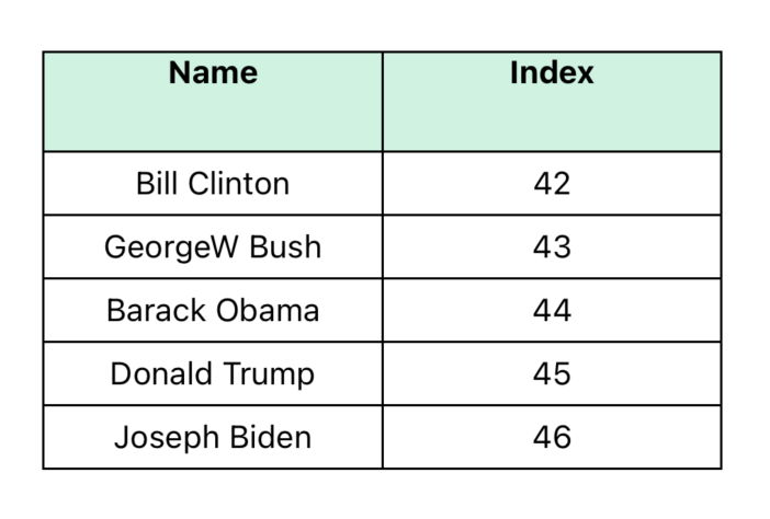
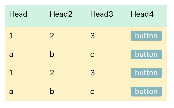
### Basic Table
- [`BasicExample.tsx`](./example/src/BasicExample.tsx)
 ```tsx
import { Table, Row, Rows } from 'react-native-tabeller';
import { View, StyleSheet } from 'react-native';
export const BasicExample = () => {
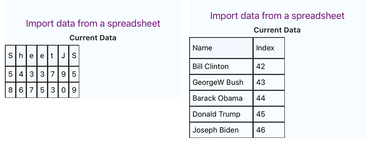
const tableHead: string[] = ['Name', 'Index'];
const tableData: string[][] = [
['Bill Clinton', '42'],
['GeorgeW Bush', '43'],
['Barack Obama', '44'],
['Donald Trump', '45'],
['Joseph Biden', '46']
];
return (
);
}
const styles = StyleSheet.create({
container: {
flex: 1,
padding: 16,
paddingTop: 30,
backgroundColor: '#fff'
},
head: {
height: 44,
backgroundColor: '#C6F3E0'
},
text: {
textAlign: 'center',
padding: 5
},
headText: {
textAlign: 'center',
fontWeight: 'bold'
}
});
```
---
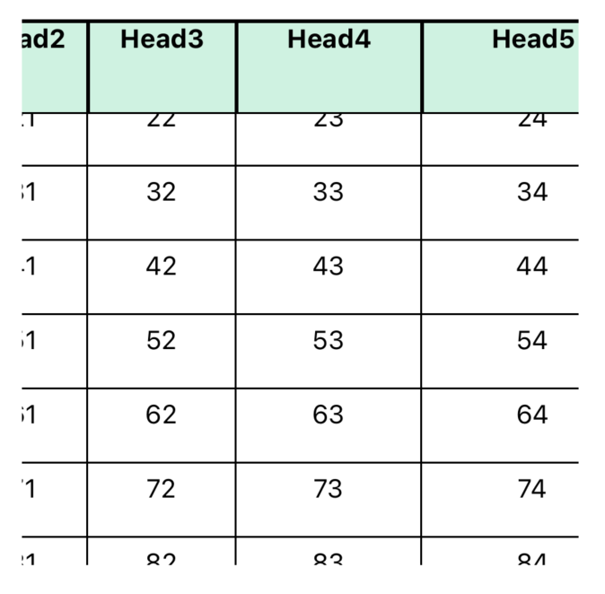
### Scrollable Example
- [`ScrollableExample.tsx`](./example/src/ScrollableExample.tsx)
```tsx
import { Table, Row, Rows } from 'react-native-tabeller';
import { View, StyleSheet } from 'react-native';
export const BasicExample = () => {
const tableHead: string[] = ['Name', 'Index'];
const tableData: string[][] = [
['Bill Clinton', '42'],
['GeorgeW Bush', '43'],
['Barack Obama', '44'],
['Donald Trump', '45'],
['Joseph Biden', '46']
];
return (
);
}
const styles = StyleSheet.create({
container: {
flex: 1,
padding: 16,
paddingTop: 30,
backgroundColor: '#fff'
},
head: {
height: 44,
backgroundColor: '#C6F3E0'
},
text: {
textAlign: 'center',
padding: 5
},
headText: {
textAlign: 'center',
fontWeight: 'bold'
}
});
```
---
### Scrollable Example
- [`ScrollableExample.tsx`](./example/src/ScrollableExample.tsx)
 ---
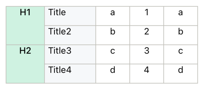
### Sticky Column Example
- [`StickyColumnExample.tsx`](./example/src/StickyColumnExample.tsx)
---
### Sticky Column Example
- [`StickyColumnExample.tsx`](./example/src/StickyColumnExample.tsx)
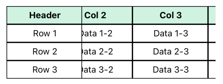 ---
### Example three
- [`ExampleThree.tsx`](./example/src/ExampleThree.tsx)
---
### Example three
- [`ExampleThree.tsx`](./example/src/ExampleThree.tsx)
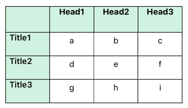 ---
### Example Four
- [`ExampleFour.tsx`](./example/src/ExampleFour.tsx)
---
### Example Four
- [`ExampleFour.tsx`](./example/src/ExampleFour.tsx)
 ---
### Example Five
- [`ExampleFive.tsx`](./example/src/ExampleFive.tsx)
---
### Example Five
- [`ExampleFive.tsx`](./example/src/ExampleFive.tsx)
 ---
### SheetJS Fetch Example
- [`SheetJSExample.tsx`](./example/src/SheetJSExample.tsx)
---
### SheetJS Fetch Example
- [`SheetJSExample.tsx`](./example/src/SheetJSExample.tsx)
 ---
---
## Properties
### `Table` Component Properties
| Prop | Type | Description | Default |
|---|---|---|---|
| **style** | Style | Container style for the table | `null` |
| **borderStyle** | Object | Table border line width and color | `{ borderWidth: 0, borderColor: '#000' }` |
| **children** | ReactNode | Table content | Required |
### `TableWrapper` Component Properties
| Prop | Type | Description | Default |
|---|---|---|---|
| **style** | Style | Container style | `null` |
| **borderStyle** | Object | Table border line width and color | `{ borderWidth: 0, borderColor: '#000' }` |
| **children** | ReactNode | TableWrapper content | Required |
### `Cell` Component Properties
| Prop | Type | Description | Default |
|---|---|---|---|
| **data** | string \| number \| null | Cell content | `null` |
| **width** | number | Cell width in pixels | `null` |
| **height** | number | Cell height in pixels | `null` |
| **flex** | number | Flex value for the cell | `1` (if no width, height, or style) |
| **style** | StyleProp | Container style | `null` |
| **textStyle** | StyleProp | Text style for cell content | `null` |
| **borderStyle** | BorderStyle | Cell border line width and color | `{ borderWidth: 0, borderColor: '#000' }` |
| **cellContainer** | ViewProps | Props passed to the cell container | `{}` |
| **onPress** | (data: any) => void | Callback when cell is pressed | `null` |
| **children** | ReactNode | Children to render inside the cell | `null` |
### `Row` Component Properties
| Prop | Type | Description | Default |
|---|---|---|---|
| **data** | Array | Array of data items for each cell in the row | Required |
| **style** | StyleProp | Container style | `null` |
| **widthArr** | number[] | Array of widths for each cell | `[]` |
| **height** | number | Height for the entire row | `null` |
| **flexArr** | number[] | Array of flex values for each cell in the row | `[]` |
| **textStyle** | StyleProp | Text style applied to all cells in the row | `null` |
| **borderStyle** | BorderStyle | Border line width and color | `{ borderWidth: 0, borderColor: '#000' }` |
| **cellTextStyle** | (item: any) => StyleProp | Function to generate custom text styles for individual cells | `null` |
| **onPress** | (item: any) => void | Callback when a cell is pressed | `null` |
### `Rows` Component Properties
| Prop | Type | Description | Default |
|---|---|---|---|
| **data** | Array> | 2D array of data for rows and cells | Required |
| **style** | StyleProp | Container style | `null` |
| **widthArr** | number[] | Array of widths for each column | `[]` |
| **heightArr** | number[] | Array of heights for each row | `[]` |
| **flexArr** | number[] | Array of flex values for each column | `[]` |
| **textStyle** | StyleProp | Text style applied to all cells | `null` |
| **borderStyle** | Object | Border line width and color | `{ borderWidth: 0, borderColor: '#000' }` |
| **cellTextStyle** | (item: any) => StyleProp | Function to generate custom text styles for individual cells | `null` |
| **onPress** | (item: any) => void | Callback when a cell is pressed | `null` |
### `Col` Component Properties
| Prop | Type | Description | Default |
|---|---|---|---|
| **data** | Array | Array of data items for each cell in the column | Required |
| **style** | StyleProp | Container style | `null` |
| **width** | number | Width for the entire column | `null` |
| **heightArr** | number[] | Array of heights for each cell | `[]` |
| **flex** | number | Flex value for the column | `null` |
| **textStyle** | StyleProp | Text style applied to all cells in the column | `null` |
| **borderStyle** | BorderStyle | Border line width and color | `{ borderWidth: 0, borderColor: '#000' }` |
### `Cols` Component Properties
| Prop | Type | Description | Default |
|---|---|---|---|
| **data** | Array> | 2D array of data for columns and cells | Required |
| **style** | StyleProp | Container style | `null` |
| **widthArr** | number[] | Array of widths for each column | `[]` |
| **heightArr** | number[] | Array of heights for each cell in a column | `[]` |
| **flexArr** | number[] | Array of flex values for each column | `[]` |
| **textStyle** | StyleProp | Text style applied to all cells | `null` |
| **borderStyle** | Object | Border line width and color | `{ borderWidth: 0, borderColor: '#000' }` |
### `StickyTable` Component Properties
| Prop | Type | Description | Default |
|---|---|---|---|
| **data** | Array> | Full table data including first column | Required |
| **stickyColumnWidth** | number | Width of the sticky column | Required |
| **columnWidths** | number[] | Widths for non-sticky columns | `[]` |
| **style** | StyleProp | Style for the container | `null` |
| **cellStyle** | StyleProp | Style for cells | `null` |
| **textStyle** | StyleProp | Text style for cell content | `null` |
| **headerStyle** | StyleProp | Style for header row | `null` |
| **headerTextStyle** | StyleProp | Text style for header cells | `null` |
| **borderStyle** | BorderStyle | Border style | `{ borderWidth: 1, borderColor: '#000' }` |
---
## Notice
+ `Col` and `Cols` components do not support automatic height adjustment
+ Use the `textStyle` property to set margins - avoid using padding
+ If the parent element is Not `Table` component, specify the `borderStyle`
```tsx
{/* add borderStyle if the parent is not a Table component */}
```
## Contributing
See the [contributing guide](CONTRIBUTING.md) to learn how to contribute to the repository and the development workflow.
## License
Apache License, Version 2.0 [(ALv2)](LICENSE)